How I designed the logo for CoMaps and learned a lesson

A few months ago, I was looking for a new maps application to replace Mapy.cz on my Android phone, which I had been using for the past few years. In an unexpected chain of events, this ultimately led me to design the official logo for CoMaps, a community-driven fork of Organic Maps.
It still blows my mind to see my creation as the logo of an app that thousands of people use every day!
This experience not only allowed me to make my first meaningful contribution to an open-source project (which makes me incredibly proud) but it also opened my eyes to the myriad ways individuals can get involved in the open-source world, even without any coding skills. In this post, I will outline the full story, share behind-the-scenes insights, and early drafts from the design process. But let's start from the beginning.
How I discovered CoMaps
My requirements for the new maps app were quite simple. It should be:
- Based on OpenStreetMaps (usually great maps for hiking/exploring)
- Open-source and privacy-respecting (made by humans for humans)
- Offline Maps and Navigation (no dependence on connectivity)
- Easy to use with a smooth UI/UX (I love OsmAnd for it's power features, but I don't like to daily drive it)
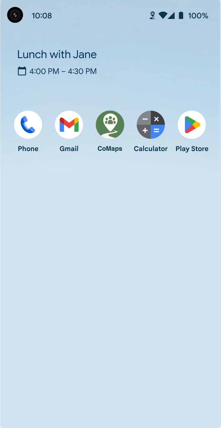
Those requirements quickly led me to Organic Maps, a well-regarded staple in the open-source Navigation Space. While the app itself works perfectly fine, I did discover an open letter from long-standing contributors, raising concerns about the project's governance and transparency.
Because those concerns were not adequately addressed by the maintainers of Organic Maps, a new fork was created. CoMaps was born.
The main goals of this fork are to develop a community-driven, not-for-profit open-source application with maximum transparency and a commitment to community-led decision-making. That sounded promising.
Intrigued, I installed the first test release, created a Codeberg account, and joined the discussion. I was welcomed warmly by the highly motivated contributors, and I immediately appreciated the commitment to involve the community in all meaningful decisions. Only days after my first encounter, I was able to participate in the voting process to determine the main color scheme for the app. That was fun and felt meaningful.
Over the next weeks, I created my first issues for improvements, bugs, and feature requests in the main CoMaps-Repo and enjoyed the constructive discussion that evolved around them - how cool is that? I can get involved in the development of an app by providing feedback? That's pretty neat.
Then I found an issue titled Create project logo - community ideation and iteration and decided to take a look.
Following the naming process and decision of the color scheme, a logo was supposed to be the next step in the "branding process" to find the new visual identity of the project. That sounded exciting, so I kept scrolling through the issue, where people were already discussing the first ideas and concepts for the new CoMaps logo. And, well - I got sucked right in.
My mind is weird sometimes - I tend to get random sparks of inspiration, which often burn short but bright and result in an unexpected deep dive. Well, this was one of those sparks: I was immediately inspired by the early idea submissions, and my mind started to circle ideas of my own. Which leads us to...
The design process
I will structure the design process into sections and share personal insights for each stage, starting from my first concept sketches all the way to the final refined submissions.
The ideation phase
The first thing I did (after looking through the already posted ideas) was to rip out a sheet of paper from a notebook and scribble down my very first, truly rough concepts. I was just brainstorming ideas that played with the letters "C" and "M" from "CoMaps" and with symbols that I associated with the theme of "Maps" and "Navigation".
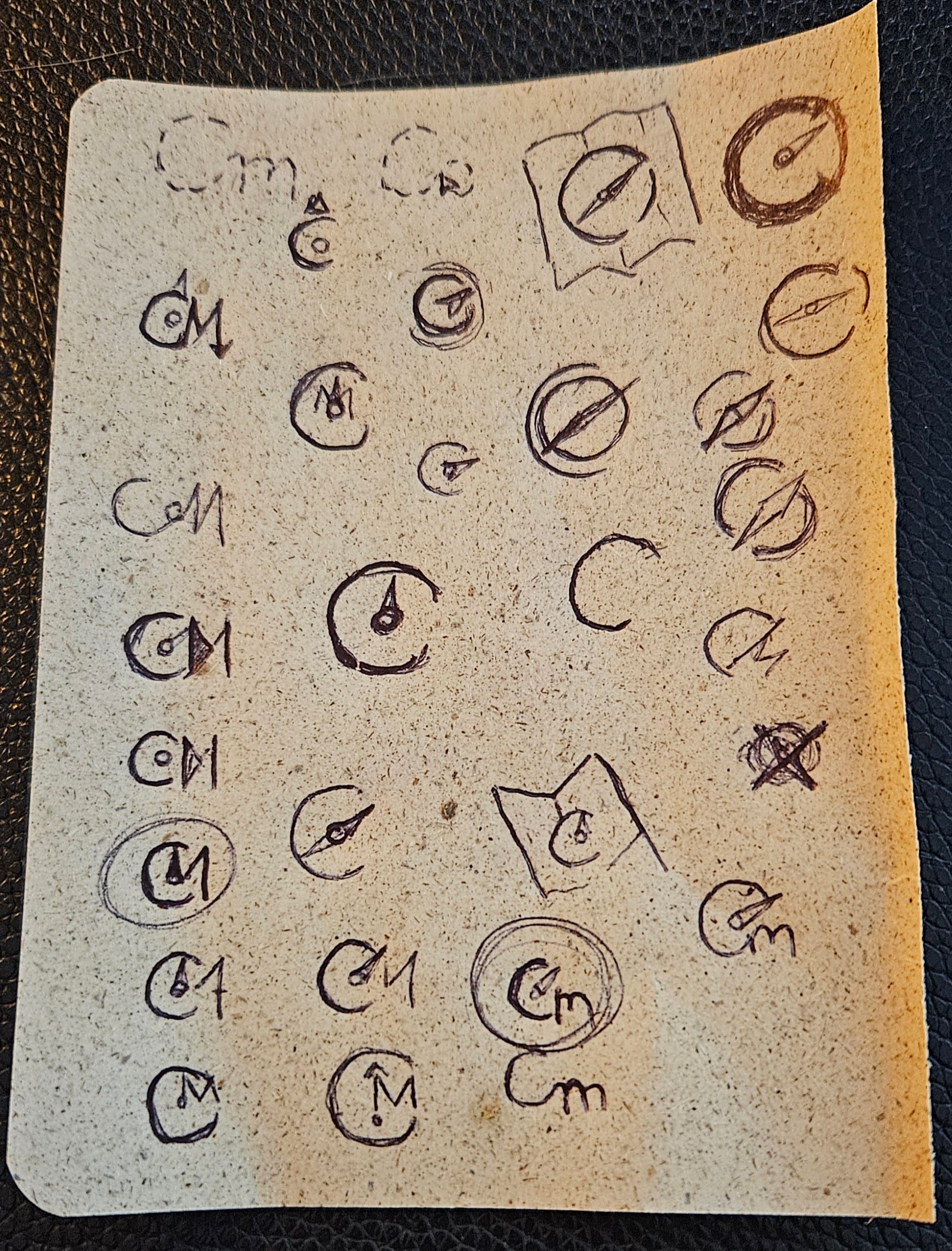
My first sketches & drafts for the CoMaps-Logo - not pretty, but a solid start to get thinking
To clarify: All final design work and submissions are hand‑made.
During that process, I noticed that the name "CoMaps" shares all the same letters with the word "Compass", which was one of my first symbolic associations for a navigation app. And well... I grew quite fond of the idea and started to ideate a lot of drafts based on this concept.
The feedback I received on those early drafts led to more drafts exploring different ideas, which all tried to incorporate the (in my opinion) main values + selling points of CoMaps in some way or another:
- It is a maps/navigation app
- It is community-driven and open-source
In my mind, a "good" logo should somehow communicate those values, while staying simple, easy to read and recognize, and without relying (too much) on colours so that it can easily be used in many circumstances (e.g., monochrome without a background). So these became my personal "guiding principles" from now on, which resulted in a ton of new concepts. Can you tell that I spend a lot of my evenings on this?
Based on additional community feedback, I continued to experiment and add drafts to the discussion. At this "early" stage of finding a design, my philosophy has always been to "get ideas out" so that they can be talked about - it does not matter if they are "good" or pretty - as long as they are created, people will have opinions on them which they wouldn't if the concept did not exist. I find that this approach leads to more insights as it quickly irons out what resonates and what does not.
More concept-ideas/refinements of first drafts. Some of them clearly tried to incorporate "too much" :)
All of this happened in this issue on Codeberg, if you want to take a closer look yourself.
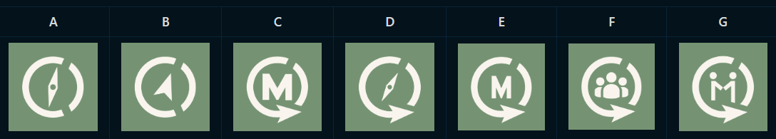
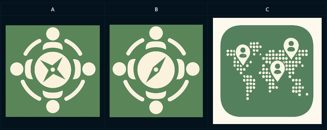
In the end, the maintainers of the project organised a first community voting round (June 7, 2025) to narrow down the options to the most popular ones, for which I submitted the following designs:


My submissions for the first voting round - not that the Simple Compass-Needle-Design is a refined version of one of my ideas created by @nclm
And it turned out, four of my propositions were chosen to advance to the next stage among some lovely ideas from other contributors! Which leads us to the next stage...
The refinement phase
During this stage, I tried to refine each of my concepts based on community feedback and personal ideas. Therefore, I will break this stage up into sections for each logo concept.
Concept 1: "CO-Arrow"
One of my personal favorites from the start for the following reasons:
- To me, it is clean, simple, balanced, and recognizable (without relying on color)
- It remains legible, even at a small scale, and works without a background
- It incorporates the letters "C" and "O" from CoMaps, which stand for Community/Collaboration
- It communicates the maps/navigation-theme with the "navigation arrow"
To refine this concept, I started a separate issue to post and discuss my ideas. There I created the following iterations based on the feedback I got.
Some of the refinement-iterations I went through exploring different feedback-ideas
In the end, I didn't change too much for my final submission - I basically just made everything a bit bolder (increased the size of the arrow and the width of the circle-line) and went with more rounded corners compared to my "original design".
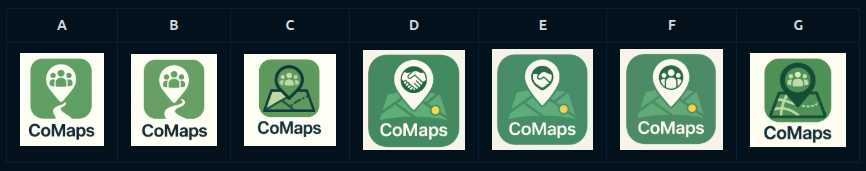
Concept 2: "Windy Roads"

This concept is a little different as it leans more towards the traditional "app-icon" and is a bit less stylized. I personally liked this idea for the following reasons:
- It is a unique and recognizable shape that is still relatively clean
- It clearly communicates the maps/navigation theme with the windy road and the location pin
- It also incorporates the community aspect with the human figures in the pin
But I also had some concerns about this logo idea:
- Legibility at smaller sizes
- Look in contexts other than as an app icon (e.g., on a website or on a print)
- Some people associated it with a "social" app because of the human figures, which is not quite what CoMaps is (it does have a strong community aspect, though)
So here are some of the iterations I tried (from this issue), but to be honest, in the end, I didn't really change this concept for the final submission :)


Collection of iterations created during the refinement phase - which all got discarded :)
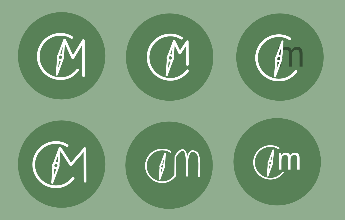
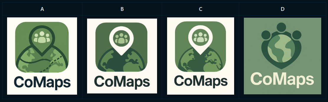
Concept 3: "COmpass"
This Logo is a special case, as this version was created by @nclm based on one of my early concepts in the first ideation issue. Due to time constraints, I took it over from him to provide the final SVG files for submission, but I didn't really change anything, as he had already done such a great job!
What I liked about this concept:
- It is really simple/clean, sharing most of the "pros" with the CO-Arrow-Concept
- It includes the "C" and the "O" from CoMaps
- It is a Compass which shares almost all letters from CoMaps and communicates "Navigation/Maps" (I still love this coincidence)
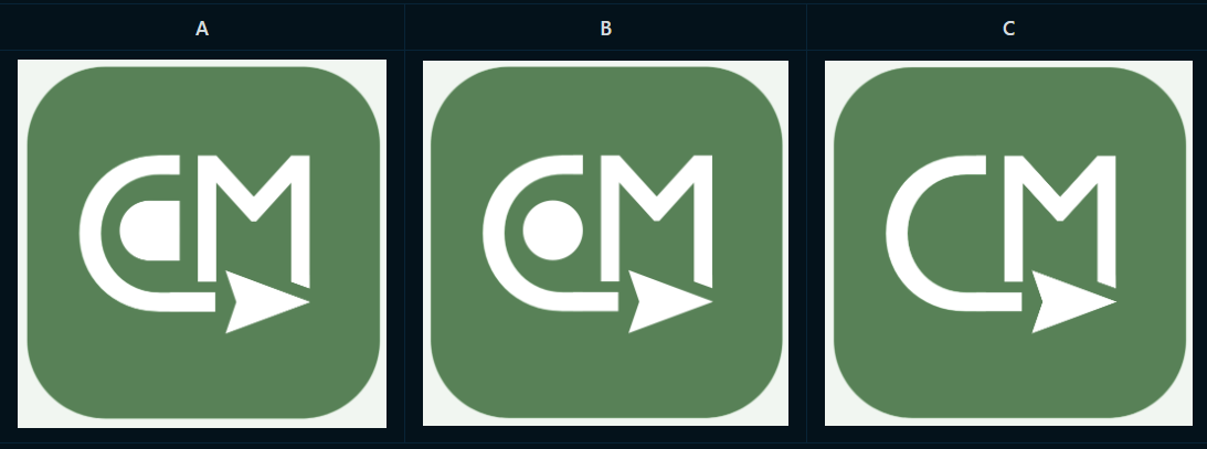
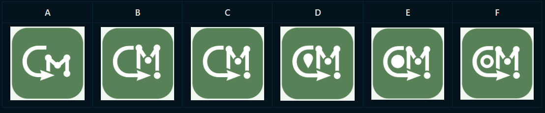
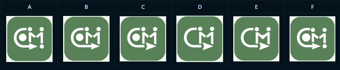
Concept 4: "CM-Split"
Now we've arrived at the last of my concepts that made it through the first round of voting - and this is also the one where I experimented the most (as I wasn't too happy with the original design). Here, my final submission does look quite different. But let's start with what I liked about this one first:
- It includes the "main-letters" of CoMaps ("C" + "M")
- It has a compass needle to communicate the maps/navigation theme
- It is decently clean/simple with a relatively unique shape
On the contrary, I also had a couple of concerns with this design:
- It feels a bit unbalanced to me
- I kept seeing an animal shape (maybe a dinosaur or a bird) in the Needle-M-Shape
- It feels a bit "chaotic" (I like it more when things align consistently ^^)
In this issue, I posted a good amount of iterations trying to clean up the design and create something a bit more balanced!


Some of the many refinement-iterations I made for this concept - I ended up really liking the one in the middle for its shape which combines a location pin, navigation-arrow, "C-M" and even a human-figure in the negative space (how nice is that?!)
The rule for the final voting round stated that only one version of each logo-concept should be submitted, which confronted me with some really tough decisions - especially for the CM-Split-Concept, where I had an especially tough time making a choice! But I somehow managed to choose an option after a long (mental) debate, which finally brings us to...
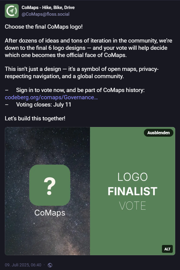
The final voting round
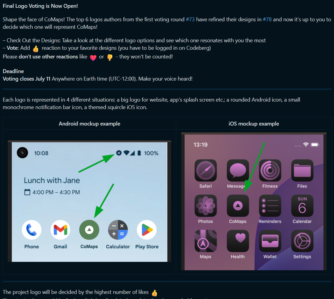
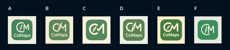
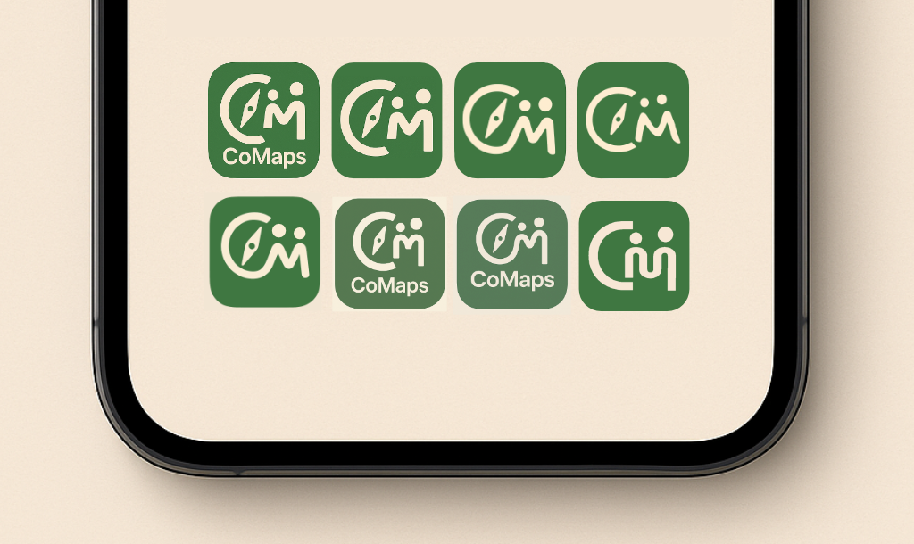
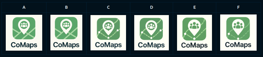
After refining the logos for several weeks (and spending some lovely camping/hiking weekends using CoMaps with friends), it was finally time for the final community decision to determine the new logo of CoMaps.
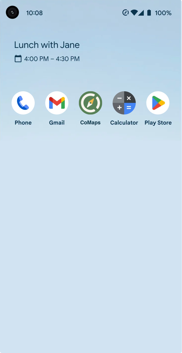
A new issue was created to host the voting, and an initial post explained all the rules for this process. To enable an even playing field, one of the contributors (@yannikbloscheck) had kindly created a unified presentation of all the submissions in different scenarios, including mockups for both iOS and Android.
I ultimately submitted the following versions for the final community voting round (phone screen mockups created by @yannikbloscheck):
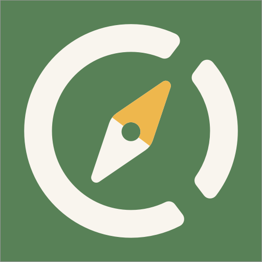

My final submission for the COmpass concept


My final submission for the Windy-Road concept
My final submission for the CO-Arrow concept

My final submission for the CM-Split concept
On the 9th of July, the final voting process started with the official announcements on all social channels of the CoMaps-Team.
And so the voting began, and with it a new (personal) obsession to impulsively check my phone to take a look at the current state of thumbs-ups - despite all my best efforts to use my phone less ^^
The winning logo
After five long days, the results were finally in. The community had made a decision.
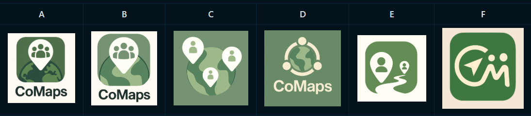
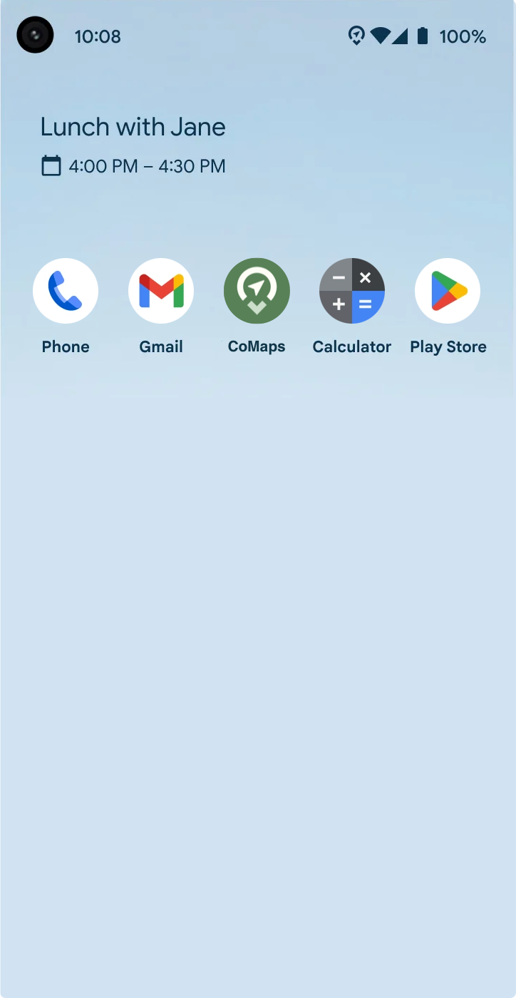
Meet the new CoMaps-Logo.... Made by me! o.O
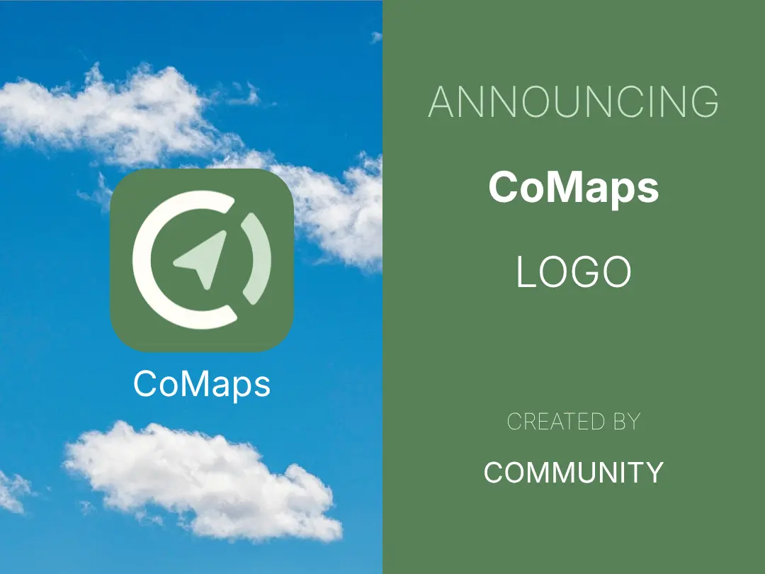
Yes, roughly three months after my first post in the CoMaps-Project on Codeberg, I had contributed the new logo for the app!
Here's the Text from the official announcement on Mastodon:
Introducing the CoMaps Logo!
We're proud to reveal the logo for CoMaps — designed and chosen by the community.
From maps to code to design, CoMaps is 100% community-powered — and this logo is no different. It’s a symbol of what we’re building together: free, open, and offline map navigation.
The winning logo was created by @Flummic. The initial round had 21 logos submitted, 6 finalists, followed by a collaborative iteration process.
Thank you to everyone who shaped this milestone.
I feel incredibly honoured and grateful that my proposition was chosen, from all the great submissions, to represent CoMaps. I want to express a big "thank you" to all the people from the CoMaps Community who supported me along the way with encouraging words and/or valuable feedback. I also want to thank all the people working on the project and organizing the community for their efforts!
It still feels unreal to me to see my logo as an actual app on my phone screen, on the website, or as the profile picture on Mastodon. I can assure you that this is a truly great feeling!
Everyone can contribute
This has been a crazy experience for me, which has secured a definite spot among my highlight moments of this year! Unexpectedly, it also taught me an important lesson:
Contributing to open-source projects isn't limited to writing code. Designers, translators, writers, and testers/users all play crucial roles in the ecosystem. For instance, CoMaps thrives on community involvement in various capacities, from adding locations to OpenStreetMap, over translating text, to providing feedback on features.
This sounds so trivial, but for me, this was kind of a revelation, as I had previously shied away from participating in any projects out of my perceived lack of skill.
That's not the case - everyone can contribute something, regardless of skill or time constraints. That's why I want to encourage you to get involved yourself!
If you have any app/project you like using, look into it and find out what you could contribute. Open-source only works when people get involved! It's people like you and me who decided to offer their skills, time, and energy to the community that make free, privacy-respecting, and open-source software possible.
And it's not a one-sided endeavour either. I can assure you that you will get a ton of benefits in return for your efforts:
- Gratitude and the truly great feeling of working on something "bigger than you"
- New friendships and connections, as it is quite likely, the people you meet while contributing are nice and share similar interests
- Free Knowledge - no matter what you do, you will likely learn a lot - from soft-skills like constructive feedback and communication, all the way to technical insights from people who are far more knowledgeable than you. Also, don't underestimate the "learning by doing factor"
- A "better" software experience for yourself - Contributing allows you to influence the development and shape the tool in a desirable direction
- Potentially career capital, as many companies (especially in tech) value a portfolio of open-source contributions
How to get started
I don't know about you, but that sounds like a win-win situation to me! So what are you waiting for?
Visit the website of an interesting project and look for its get involved section. Most projects will also have some sort of communication space (e.g., Forum, a Telegram or Matrix channel) and their code and assets organized on GitHub or its (arguably better) alternatives like Codeberg, GitLab, etc.
Find out what they use and create the necessary accounts to start participating.
Oftentimes, they will also have some documentation to help you get started: a code of conduct, good starter issues, or things that need to be done. If you feel lost or don't know where to go, don't be shy - just ask someone and they'll most likely love to help you out!
Checklist to get started
To help you get started, here's a short 5-Step Checklist for you to follow:
- Pick your project (based on your interests)
- Join the conversation in the forum/chat
- Find the repo and create an account
- Read the documentation for new contributors
- Leave a first constructive comment or ask your first question
And remember, contributions can come in all shapes and sizes - from adding your opinion on an issue, to fixing bugs in the code, translating text, writing documentation, designing things, all the way to moderating the forum/chat. The possibilities are endless, and chances are high that you'll find something that suits you!
If you don't want to get your hands dirty, that's of course totally fine too. You can still talk about your preferred projects in your social circle (to spread the word), or consider donating if you have the means and the project accepts that.
Anyways - that's it from me. I hope this read was somewhat interesting and entertaining, and more importantly, I hope I successfully convinced you to look into contributing yourself! The open-source community needs all the help it can get - so let's step up, do our part, and have a ton of fun along the way!
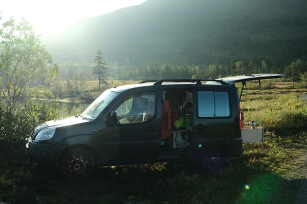
Oh, I almost forgot... CoMaps has indeed become the Mapy-Replacement I searched for. It is now the main maps/navigation app on my phone. It's free, beautiful, works offline, and best of all, it feels super smooth to use (I love to just zoom in and out). It might not be perfect (yet), but the community is working on it and I am sure we will get there!
Sources - Codeberg Issues
I have made an effort to always link my sources right in the text. For your convenience, I curated this list of relevant Codeberg issues in chronological order. Feel free to dig through the links if you wish to dive even deeper into the whole process!
- Vote: CoMaps Color Scheme
https://codeberg.org/comaps/Governance/issues/56 - Create project logo - community ideation and iteration https://codeberg.org/comaps/Governance/issues/23
- Vote: App Logo (round 1) https://codeberg.org/comaps/Governance/issues/73
- Logo finalist iteration, input, enhancements https://codeberg.org/comaps/Governance/issues/78
- Logo-Refinement: 1 - "CO-Arrow" https://codeberg.org/comaps/Governance/issues/83
- Logo-Refinement: 3 - "Windy-Road-Pin" https://codeberg.org/comaps/Governance/issues/84
- Logo-Refinement: 6 - "CM-Compass-Split" https://codeberg.org/comaps/Governance/issues/85
- Logo-Refinement 4: COmpass https://codeberg.org/comaps/Governance/issues/99
- Vote: App Logo (round 2) https://codeberg.org/comaps/Governance/issues/102
- CoMap's documentation for new contributors
https://codeberg.org/comaps/comaps/src/branch/main/docs/CONTRIBUTING.md
Feedback
I hope you enjoyed that long wall of text (and pictures). If yes, feel free to let me know in the comments, via mail, or on Mastodon! I'd love to hear your feedback, as I'm still new to writing blog posts and trying to figure things out :)
I would also love to know which design you personally liked most and why!